2022-04-27 | Blog 013
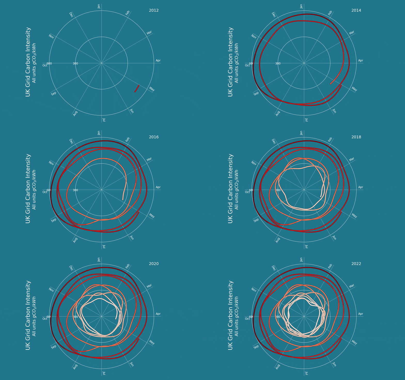
Another plot in less than a week! This one plots UK grid carbon intensity for the last 10 years.

Click image to see larger version.
I realise this isn't the best way of displaying the data, but I got this format stuck in my head and really wanted to see it through.
The data is from the National Grid Carbon Intensity Dashboard.
Quite a lot went into this plot, the full .py file can be downloaded here. There was: plot smoothing with Scipy Interpolate, covert from cartesian to polar coordinates, colour maps, trickery with zorder and background lines, plotting text in a circle, and plotting in increments to give the GIF effect.
The plot was made, as usual, with Python and Matplotlib.pyplot. For the GIF, I plotted each frame and then combined with the package imageio. I've had a lot of trouble in the past making GIFs with Matplotlib, this way seems to work so I've stuck with it. I usually edit the GIFs later on with ezgif.com
I think I'm going to make a gallery or something to store all these plots for quick reference.
Rory